5 Simple Website Design Details to Increase Website Conversion Rates
The primary purpose of your business website is to produce sales through lead capture. What if you were able to convert more of the traffic that comes to your site into sales? Here are 5 simple website design details that you can implement for increased lead conversion.
1. Email Opt-In:
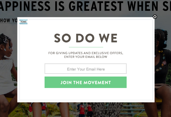
One of the simplest, most straightforward methods for increasing conversion rates is to simply ask for an email address, like this:
Once a visitor to your site leaves, they are gone forever unless you have a way to touch them again. An email address allows you to reach out to them and invite them back to your site. There are several ways to procure emails – a pop-up, as seen above, is an aggressive ask, while a sidebar button is a more passive ask. If you are concerned about turning off your customers with a pop-up, start with a passive button and track results. You can then dial up the heat with gradually more aggressive asks until you find the tone that works.
2. Call to Action:
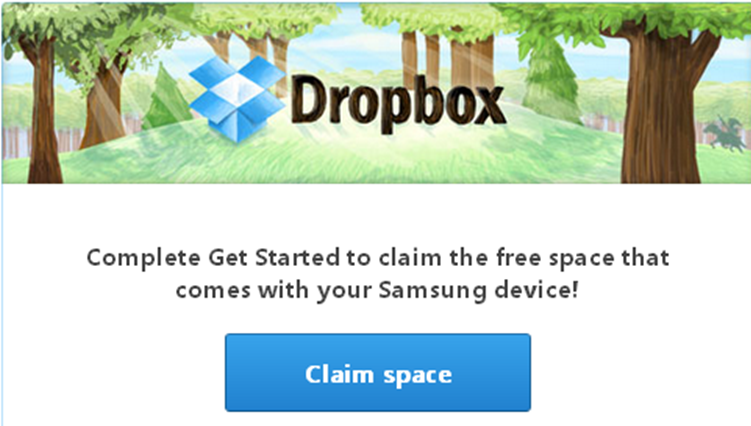
I am amazed at how many websites include a weak call to action or no call to action at all. What action do you want visitors to your site to take? If you want them to call you, then prominently place your phone number on each page of your site with “Call Today” next to it. If you want them to purchase a product on your e-commerce site, then put a “Buy Now” button where they will not miss it. You can’t get what you don’t ask for!
3. Right size your images:
You might not think this really matters, but having images that are larger than they need to be makes website pages load slowly. Google tracks page load speeds and downgrades slow loading sites, which means low SEO rankings. Your images shouldn’t be larger than 800 pixels wide, and a resolution of 72 dpi is enough.
4. Use the right images:
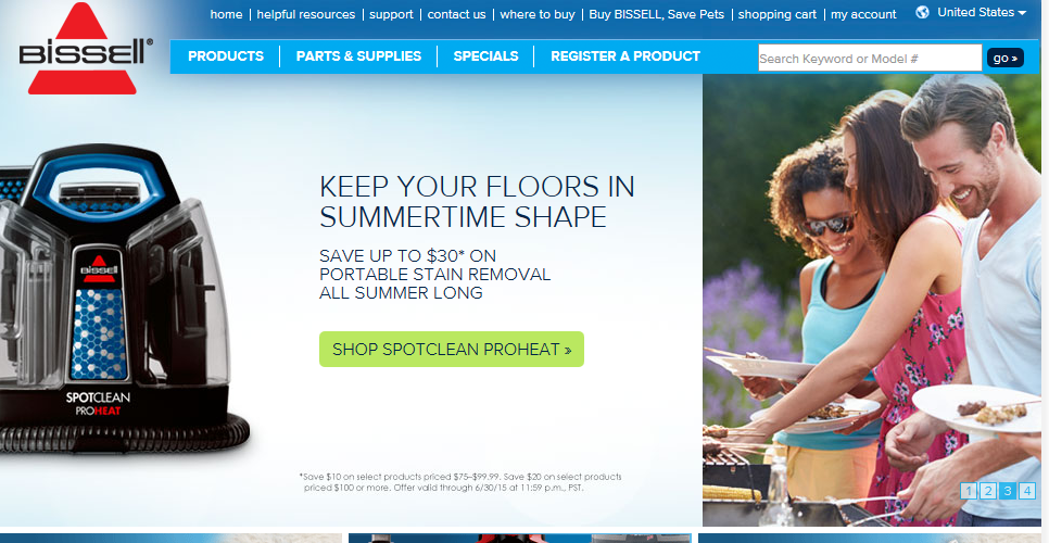
Are the images you use on your website appealing to your ideal customers? The simplest way to know is to ask them. Pick a handful of your prior customers as a sample group, and solicit their opinion of your website. If you are still having a hard time discerning what your images should be, then default to lifestyle images that support the reason to buy your product. For example, Bissell, the vacuum cleaner manufacturer, uses a picture of a summertime cookout to reinforce why you should buy their floor cleaning products:
You can get creative with this, but remember that people want to be happy, to be with other people, to be relaxed, and to feel successful. Use images that support these feelings, to reach your customers emotionally and help them commit to a sale.
5. Testimonials:
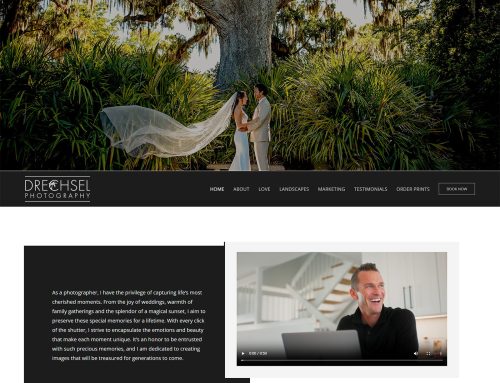
At a basic level, a sale is going to occur only if the purchaser feels they can trust the seller. Overcome this objection early with testimonials on your website. Written testimonials are good, written testimonials with a picture of the person giving the testimonial is better, and a video testimonial is best.
Is your website converting leads? Contact us today and we can provide an assessment of your current site and offer recommendations for improvement.

